Coaching — Brand Sprint
Five Things Every Ranch or Farm Website Needs
6 MIN READ
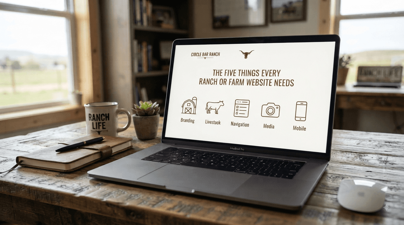
A lot of ranch and farm websites are built backward — a photo gallery, a family history essay going back three generations, and a contact form buried at the bottom like an afterthought. Meanwhile the actual reason someone came to the site — can I buy from you, and how — is nowhere to be found. If your website isn't converting, it's usually missing one of these five things, and it's not because it needs to be flashier.
1. A Clear Answer to "What Can I Buy, and How?"
Obvious, I know. Also the single most common gap I see. A visitor should know within seconds what you sell and how to get it. If they have to hunt for it, you've already lost most of them — nobody's digging through five pages to figure out if you take orders.
2. Real Photos of the Actual Operation
Not stock photography. Not even beautiful-but-generic pasture shots. Your actual animals, your actual fields, your actual hands doing the actual work. This is the single biggest advantage you have over a grocery store shelf, and I watch ranchers waste it constantly on imagery that could belong to anyone.
3. A Simple Story, Not a Family History Essay
Your About page doesn't need four generations to be effective. It needs to answer, fast: who are you, why do you do it this way, why should someone trust you with their food dollars. A tight paragraph beats a meandering history lesson every time — people are deciding whether to buy from you, not grading a family history report.
4. A Way to Contact You That You'll Actually Answer
A contact form nobody checks is worse than no contact form, because it fakes responsiveness without delivering it. Whether it's email, a DM link, or a phone number — make sure it's a channel you'll actually respond to, and fast. Trust in direct sales gets built or destroyed in how quickly and personally you answer.
5. Something to Capture Interest Even When You're Sold Out
Most operations aren't selling year-round. If your site has no way to catch interest during the gaps — an email signup, a waitlist, anything — you're losing every visitor who shows up at the wrong time, and most of them won't come back on their own to check. Give them a reason to leave contact info even when there's nothing to buy today.
The Pattern Underneath All Five
None of these are about design trends or how modern the site looks. They're about removing friction between someone's interest and their ability to act on it. A plain, honest site that does these five things will outsell a beautiful one that doesn't. Every single time.
If your site's missing more than one of these, that's rarely a website problem — it's usually a sign the underlying story hasn't been locked in yet, and the website's just where that becomes visible. That's exactly the kind of full-picture fix a Brand Sprint is built for.
Good work deserves a good story.
© 2026 Plainspoken Co. — Built for the people who grow and raise real food.